Your mission is to take two photos of two opposing forces.
Examples?


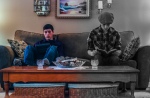
FOR THIS PHOTO CHALLENGE, YOU WILL HAVE TWO DIFFERENT IDEAS NEXT TO EACH OTHER. MAKE SURE EACH IDEA HAS IT’S OWN LOOK. IT’S A NEW TWIST I’M BRINGING TO THIS PHOTO CHALLENGE. TWO DIFFERENT IDEAS, TWO DIFFERENT LOOKS.

THE PRINCIPAL AND ELEMENT FOR THIS ONE IS CONTRAST:
CONTRAST
Contrast is the juxtaposition of opposing elements eg. opposite colours on the colour wheel – red / green, blue / orange etc. Contrast in tone or value – light / dark. Contrast in direction – horizontal / vertical.
The major contrast in a painting should be located at the center of interest. Too much contrast scattered throughout a painting can destroy unity and make a work difficult to look at. Unless a feeling of chaos and confusion are what you are seeking, it is a good idea to carefully consider where to place your areas of maximum contrast.
IN THIS CASE, THE CONTRAST IS IN IDEAS.
If you choose to do a diptych, that will only count as one.
Two photos due in on or before Friday, 9/25. Upload photos to HHS Photography and to the Google Classroom Link..
REQUIRED RESPONSE: POST THREE DIFFERENT IDEAS YOU HAVE FOR THIS PHOTO CHALLENGE.

gay side vs straight side
full cup vs empty cup
half blurry vs half clear
LikeLike
Nice v. Angry
Black v. Bright colors (Clothing wise)
Soda v. Water (A change in liquids for some reason)
LikeLike
Brown eye vs Blue eye
Good vs Evil
Black converse vs pink converse
LikeLike
Old car vs. New car
Vinyl vs. Cd
Xbox 360 vs. Atari
LikeLike
Metal head vs Average guy
Gamer vs Student
Vinyl vs IPod
LikeLike
1. A yellow triangle, and a purple sphere.
2. A light furred cat and a dark furred dog.
3. A sky during a sunset and a sky during a rain storm.
4. A Black mouse and a white mouse.
LikeLike